iUTAH Team - Undergraduate iFellows
Jared Stewart
University of Utah
Mentors:
Faculty: Peter Howe, USU
Near-Peer: Yajie Li, USU
Research Focus:
Research Focus Area 2
Project: Analyzing and mapping warning messages about extreme heat on social media
Major:
Urban Ecology
Biography:
Jared Stewart is an undergraduate student studying urban ecology at the University of Utah. As a prospective planner he hopes to make substantial contributions to the future of water in Utah. Jared is excited to be part of iUTAH by participating as an iFellow. He believes that being an iFellow is a great first step to help ensure that Utah maintains a high quality and quantity of water for future generations. In his personal life Jared enjoys cycling, trail running, and spending time with friends and family.
Research Abstract:
Risk Communication on Social Media to Spanish-Speaking Populations
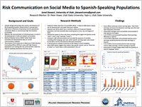
Presented by: Jared Stewart
July 2017
While not specifically tied to Utah’s hydrology, heat is the leading cause of weather related deaths in the United States. It is important that agencies and organizations understand heat and other extreme weather-related risks, especially as climate change exacerbates the frequency and severity of extreme weather events. Life threatening risks need to be communicated effectively to the public so that necessary precautions can be taken and lives saved. The United States is growing in cultural, ethnic, and linguistic diversity, potentially complicating efforts to communicate risk to the population at large. Areas currently facing such challenges are those with large Spanish-speaking populations, such as communities in the vicinity of the southwest border of the United States, which have a need for risk communication in the Spanish language. I analyzed Twitter data from local National Weather Service (NWS) accounts to determine how forecasting offices communicate to Spanish-speaking populations. I found that some offices automate selected warning types (flood and thunderstorm warnings). Automated tweets in these particular offices are similarly represented in both Spanish and English. Other warning types, such as heat and special marine warnings, were not communicated equivalently in English and Spanish from all forecasting offices. These findings indicate that the NWS could improve communication to Spanish-speaking populations by automating more tweets or by allocating greater resources to create Spanish translations of critical tweets. A potential limitation of this research is that communication through Twitter is assumed to be representative of how the NWS communicates across all mediums. This information should help iUTAH by providing perspectives on how to best communicate high risk situations to expanding minority populations.
Weekly Recap:
Week 1 | Week 2 | Week 3 | Week 4 | Week 5 | Week 6 | Week 7 | Week 8 | Week 9 | Week 10 | Week 11
Week 1: May 15-21, 2017
May 8th-12th:
"One of the best things about being an iUTAH fellow is that I get to become a mini-expert on everything about my project. This first week at USU has been jam packed of learning everything I can about heat waves and how human perception changes influences how people react to heat. I've read articles on extreme heat warning communication, case studies of historic Chicago heat waves, and about how and why humans evaluate future risks differently.
Heat waves don't seem as "wet" as some of the other iUTAH projects but they actually tie in quite well. Understanding how people view extreme heat events and how those events are communicated through news and social media channels is important because we can then understand how to improve emergency communication within the system. I'm hoping that my research this summer help reveal what still needs to be studied in depth within the field of risk communication."
May 15th-19th:
"I started off this week by attending the iUTAH orientation meeting at the University of Utah. The orientation helped me to better understand the various projects underway and meet all the excellent people I'll be working with throughout the summer. I have a feeling that the summer is going to go by fast!
Post orientation this week has been all about developing my own research questions. One thing I noticed was that the National Weather Service occasionally shares tweets in Spanish. From the samples I have taken from NWS tweet data it struck me that many people in each weather station jurisdiction may not speak English as their primary language. Does the National Weather Service communicate effectively with people who speak "less than very good English"? This summer I will use twitter data to evaluate this question. Finding the answer for this could lead to better understanding how to save lives in hot areas of the country where people die or need rescue each year. Building a new base of understanding risk and warning communication will help ensure that future generations will be adequately notified of water and otherwise significant events.
This week I also learned about coding schemes. A coding scheme is basically a detailed description and breakdown of the variables that will be looked at in a research project. Towards the end of the week I learned the coding scheme we will be using to evaluate and study tweet data on heat warnings.
In addition to coding schemes I began a GIS project that will help us display visually each area served by the various weather stations and the total population served by each area. To do this I began learning a new GIS software called QGIS. It is similar to ArcGIS but more open source. I'm looking forward to the coming week and getting more experience under my belt!"
Holding a couple books that I read abstracts from in the first week
Week 2: May 22-28, 2017
This week flew by! I have been able to get a lot done but there is still so much to research and so much work to do. The first thing I have been working on is a GIS map of the weather forecasting areas within the United States. The forecasting areas are not organized according to state lines, but use geographic boundaries and county lines instead. This week I began to organize the counties to visually show what the forecasting areas look like. I’ve sent a picture of the maps I have so far. The end goal is to show the total population served under each of the forecasting areas.
My own research has really taken off this week! I’ve narrowed down my population/research area to the southwest United States—specifically the forecasting areas that directly boarder with Mexico. I was able to use county level census data to calculate the total Hispanic population within each forecasting area. This will help me set criteria for which National Weather Service tweets I can look at and give me a higher level of reliability later on. Here is what I found (percentage is the Hispanic population of the area):
- Brownsville (89.225%)
- El Paso (58.25%)
- Midland (51.16%)
- San Angelo (not super active twitter account) (31.4%)
- Corpus Cristi (58.85%)
- San Antonio (42.55%)
- Phoenix (41.56%)
- Albuquerque (46.04%)
- Vegas (23.26%)
- Sacramento (22.42%)
There were several other forecasting areas that I wanted to use but the twitter data we have access to won’t reach far enough back to be viable for the study. I need data from June-August of 2016. We can only go back about 3000 tweets before information becomes inaccessible. If the forecasting service is on top of their Twitter game then occasionally I won’t get all the data I needed.
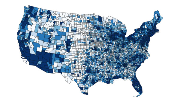
GIS map of weather forecasting areas within the U.S. #1
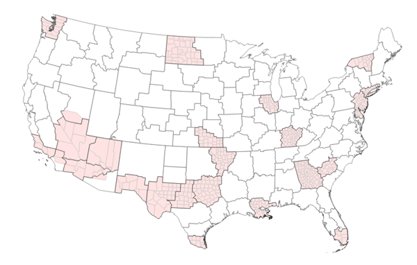
GIS map of weather forecasting areas within the U.S. #2
Week 3: May 29-June 2, 2017
This week I made significant progress on several side projects to help my near-peer mentor (Yajie) and the professor I am working with (Dr. Howe). With Yajie, I have been doing trial analyzations of tweets from the National Weather Service to make sure I understand the coding scheme (list of variables and how to categorize them) and am coding the tweets in the same way as her. This will be important so that as a second coder/analyzer I can help prove the reliability of Yajie’s study. This week we clarified some final points and reached consensus on how to classify and analyze the tweets. For Dr. Howe I was able to complete a list of the National Weather Service forecasting areas and the total population served by each. To do this I used the latest census data and a list of counties in each forecasting area and used excel functions to add things together. In the next week or so I will be able to update my map to show these populations.
Week 4: June 5-9, 2017
This week I spent a lot of time on National Weather Service Twitter feeds! I have almost completed my section of the coding/analyzation of the tweets. These particular tweets have been filtered to contain all the tweets discussing heat or extreme heat events. There are a list of 9 variables I look for in each tweet. It is interesting to me to notice the differences in communication strategies between each WFO or Weather Forecasting Office. Some offices communicate heat by using Heat Indices while others use combinations of Heat Indices, temperature and safety warnings. I hope that my work this week will help my near peer mentor in her work!
Outside of my work with iUTAH, I have been using some of my spare time to learn a new hobby. Bird watching! Logan is a great place to look for birds from your backyard to the fresh and saltwater marshes around the Great Salt Lake.
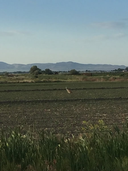
Sandhill Crane at Salt Creek Waterfowl Management Area
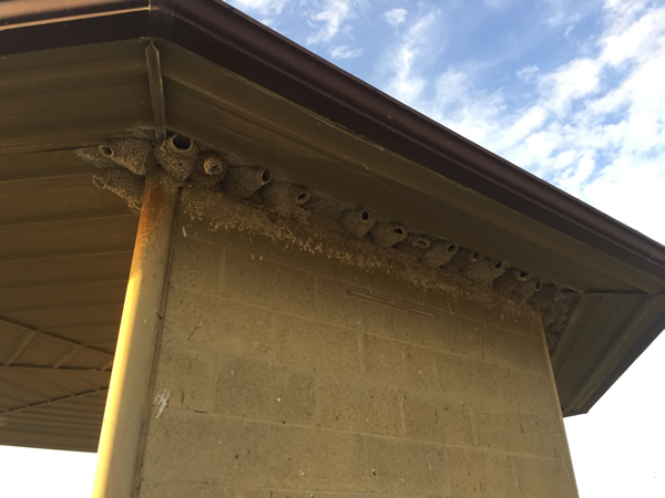
Swallow nests at Salt Creek Waterfowl Management Area
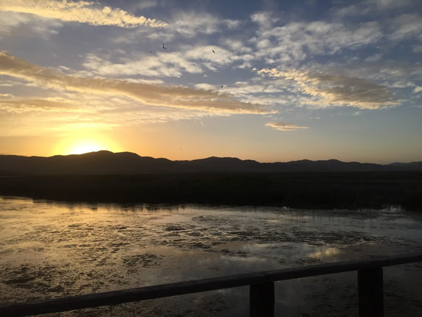
The sunset with swallows in the air at Salt Creek Waterfowl Management Area
Week 5: June 12-16, 2017
This week I finished helping Yajie with her data collection and made significant progress on my own work. By Monday afternoon I completed gathering data from a set of over 200 tweets about heat related weather events. Working with Yajie (my near peer mentor) has been excellent. It is valuable to have someone working close by who knows not just how to collect data but seeks for high quality work. I am glad to have had the chance to contribute to her work. Working with Yajie I have learned about the importance of having validity and reliability in Social Science (and science in general). It is important that I can make my studies both reproducible and accurate within the time frame that I have.
After Monday I was able to really dig in and start my own work. I revised and improved my coding scheme (plan for data collection), checked my Excel filters and started sifting through NWS tweets. Each of the tweets was selected from a list of more than 35,000 to contain key words about heat/hot weather and warning/advisory messages. I also selected tweets containing the corresponding Spanish words. My sample will include about 1,200 tweets from Weather Forecasting Offices (WFO’s) in the southwest United States and on in Miami. I choose these particular offices because they serve some of the highest Hispanic populations in the nation. The idea is to determine if these offices communicate warnings and important safety education messages effectively to Hispanic audiences. Here is a list of the offices I picked and the corresponding Hispanic population:
- Brownsville (90.04%)(BRO)(19.06%)
- El Paso (74.54%)(EPZ)(12.37%)
- Midland (47.02%)(MAF)(6.74%)
- San Angelo (27.02%)(SJT)(2.26%)
- Corpus Cristi (67.69%)(CRP)(8.33%)
- Phoenix (33.05%)(PSR)(5.55%)
- Hanford (51.98%)(HNX)(10.15%)
- Tucson (36.19%)(TWC)(3.77%)
- Albuquerque (43.94%)(ABQ)(3.23%)
- Miami (40.48%)(MFL)(11.03%)
The first percentage is the Hispanic population and the second (smaller) percentage is the percent of the total population in that WFO’s jurisdiction that speaks English not very well or not at all. Brownsville in particular has a large need for risk communication in Spanish. An interesting thing I noticed as I began collecting data from tweets is that some of the offices automate warning messages into Spanish and English. Flood, tornado, and thurderstorm warnings have been tweeted automatically in both languages whereas heat has not.
Week 6: June 19-23, 2017
Another week gone by. My one big success of the week was that I was able to finish gathering/analyzing all 1135 National Weather Service tweets! It can take a while to finish the code assignments so it really does mean a lot to have finished. I can now move forward with a more formal analysis of the tweets to determine, among other things, the number of tweets in Spanish. To check my reliability, I will also find a second person willing to gather/analyze at least 10 percent of the tweets. This is so that we can be scientifically certain that I didn’t fall asleep and mark a category wrong at any point. I have a lot of work to do from this point forward, but it is exciting to be at a point where I’ll be able to find some results and check by to my original hypothesis.
Week 7: June 26-30, 2017
This week I really started to analyze my data. It has been interesting to note the language and communication differences between automated tweets and uniquely crafted tweets. Most tweets that NWS offices automate come in English and Spanish. A big Kudos for the El Paso and Albuquerque Weather Forecasting Offices (WFO’s) for their excellent work in multi-lingual tweets! Other offices still have some work to do…
I’ve learned this week how much I still need to learn. Statistics is a field I just haven’t worked in much, and thus have little expertise. Also there is a massive amount of literature on risk perception that I could spend time reading. I did get to spend a few hours this week reading Environmental Hazards by Keith Smith. Shout out to Dr. Howe for lending me this and other excellent reads.
I came up against two small hiccups this week too. First, I realized that I had a hole in my data for the Miami WFO. When I added the tweets from Miami I had forgotten to filter/search for two words. Once I did I had an extra ~100 tweets to gather data from. It took an extra hour or two but I got the new stuff all incorporated! Second, when calculating the total population served by each WFO, I found that some counties were split in unusual ways between two or even three WFO’s. Allocating the population between these accurately was a huge task because it could take significant time to find county specific population data and then decipher where to cut the counties. At the suggestion of my near peer mentor I decided to split them evenly between each applicable WFO. This may not have been perfectly accurate, but it’s the best I can do with the time I have. I can also make it clear in any literature I produce that it only affected the population count of three WFO’s and probably not to any huge extent.
Week 8: July 3-7, 2017
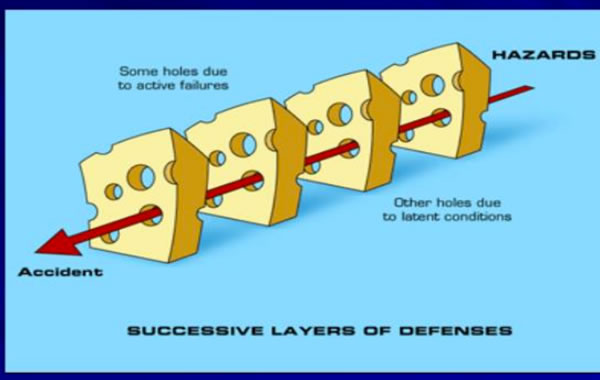
“My main focus this week was on my poster for the iUTAH symposium. I completed my map of the NWS Weather Forecasting Offices, which was a big milestone. It is good for me to work through and learn some of the GIS software! With some good feedback from Dr. Howe and from Friday’s cohort session my poster should be looking great by the time the symposium rolls around. Some of my other time was spent catching up on reading from a textbook titled Environmental Hazzardsby Keith Smith. One of the key points that Smith makes is that for a disaster to happen, “a series of cumulative events has to occur” (Smith 50-51). This is called the swiss cheese model. If the holes is each slice of cheese line up, then disaster can happen. Some things that block the holes and act as layers of defense for communities are communities could be faith based organizations, access to natural resources, availability of government aid, or even good weather. Many things can act as disaster deterrents.”
NWS weather forecasting maps
Week 9: July 10-14, 2017
“iUTAH has been the highlight of my summer! It has added to my professional skills and helped me meet a lot of good folks. From my experience at iUTAH, I feel like grad school will be the right path for me and will enable me to be the greatest benefit to communities and world we all live in. Thanks iUTAH!”
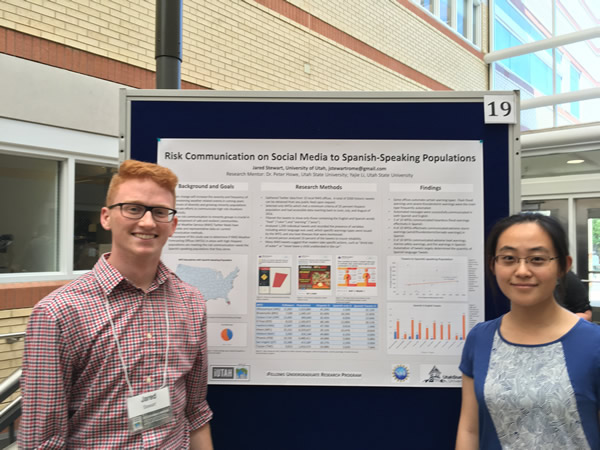
Poster presentation at iUTAH Annual Symposium
Week 10: July 17-21, 2017
No entry
Week 11: July 24-28, 2017
No entry
All content provided on this iUTAH Team - Undergraduate iFellows weekly recap is unedited, updated by each participant to provide a review of their progress, and is for informational purposes only.